Context
Agent studio helps customers create, deploy and monitor agents for running their clinical trials. It comes with pre-built agents, or users can create custom agents as well.
For example, a (CRA) can build an agent to monitor non-compliant events in the clinical trials they’re overseeing.
No versioning, no governance
Lack of versioning stalled adoption by customers, hurting revenue
Any change made to an agent overwrote its previous configuration and went live immediately.
This meant customers couldn’t validate agents before letting them access their clinical trial data. Overwriting was also a problem because it prevented auditing: once a configuration was gone, there was no record of what the agent used to do.
How does versioning work?
An agent is made of various like a system prompt, skills, etc. When one of them is modified, every agent using it receives an update. Changing any dependency or updating it increments the agent’s version.
Design goals
The best agent versioning experience will…
Ideation
How to handle updates?
The dependency card was already used to edit a dependency’s configuration. I redesigned it to handle updates on top of it.
I made the card modular, extending it when it receives an update. I ensured it scaled to all dependency types.
How to handle state change?
State changes was the most important because what the user could or couldn’t do depended on the state. My biggest insight driving this design was that version number is not important and that change of state should be made explicitly clear.
How to handle mandatory updates?
Mandatory updates are made by workspace admins, usually for security reasons. I decided to not emphasise updates as “mandatory” and bring them up only at the point of publish, incase the user had missed them, because builders have no choice but to accept them.
Note on user testing
Because conducting user tests with end users (e.g. CRAs) takes significantly longer to set up, and we were on the clock with versioning, I validated these concepts with 5 internal users in the client services team who use the product daily.
Constraints and bug fixes
Reduced scope to meet release dates
Engineering assessed that the complete design, including the settings side panel, would take longer than the release deadline allowed. Instead of pushing the date, I was asked for a middle ground. Everyone agreed the side panel was better UX, but it needed new components. So I cut it, because it fixed a consistency issue rather than anything crucial to versioning. As a result, I had to redesign the dependency card again to fit the existing, inconsistent modal.
Shipped a fix to a UI bug directly in code
After launch, I got feedback that double-digit version numbers were bleeding out of their borders on the version cards, and the draft tag looked cramped. Because it was a purely front-end change, I didn’t pull in a developer. I opened a branch in Cursor, tried a few iterations directly in code and raised a merge request in under an hour.
Bringing it all together
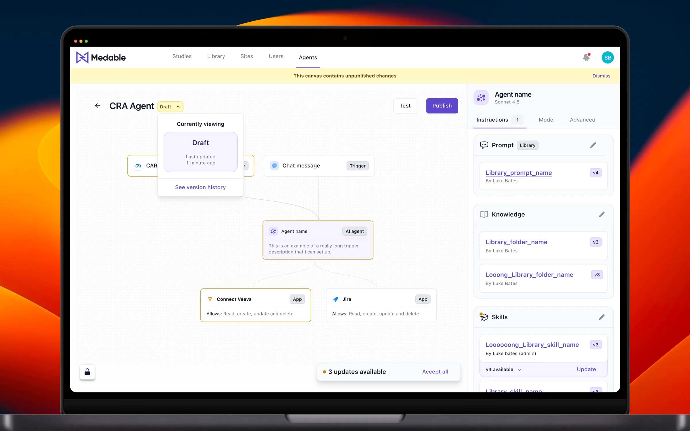
The shipped design lets builders see what state their agent is in, weigh each update before accepting it, clear mandatory updates in one pass at publish, and roll back to any previous version.
Agent state tag and version picker
The tag next to the agent’s name shows its current state: “Published” or “Draft”. It also opens the version picker, which describes the version being viewed and links to previous ones.

Unpublished changes banner
A banner appears at the top of the canvas the moment it moves to draft, giving builders clear, persistent feedback that they have unpublished changes.
Dependency card update
The dependency card shows what changed in an update, and both the previous and the latest version number, so builders can decide whether to accept it.
Unified update panel
A floating tab totals every pending update on the canvas and lets builders accept them all in one go.
Mandatory updates
Mandatory updates from workspace admins are surfaced at the point of publish, so builders accept them all in one pass instead of hunting for them across the canvas.
Version modal
The version modal lists every previous version of the agent, and lets builders roll back to one if they need to.
Reflections
Next time a deadline forces me to compromise on design, I’ll get explicit agreement from the PM to pick it up in the following release, with a ticket raised, so that the better UX stays visible.
I also got to experiment with designing in code on this project. Based on that experience:
- Designing in code isn’t suited to exploring diverse concepts; pen on paper is still the fastest.
- It shines on small problems with known solution patterns.
- It will empower design teams to own more of the front end.
At the end of the day, it’s another tool in a designer’s belt to reach for depending on the situation. I also learned about code reviews and testing: I reviewed my own code and took screenshots for testing, getting a small taste of developing and shipping something end to end.